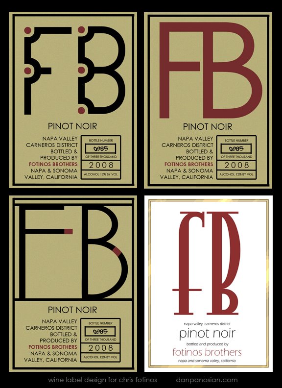
Hey, U.B., you've posted some nice designs here. I'm one of those typonazi designers who thinks type should serve a purpose: that is, be legible. Not always, of course. If typography is part of an art piece and meant to be more pattern than communication, I say go for it, but if it is meant to communicate a specific message, I believe it should be easily read FIRST and, when that task is accomplished, be ART.
My favorite, with clarity first, followed by fun, interesting design, is the bottom right design in this batch. Interesting large letterforms, great use of white space (to make the label design stand out in the marketplace) and, above all, the smaller type is easily read.
It may be the "safest choice", but it's also, to my mind, the one that would draw me in and probably get me to try the Pinot Noir.
The other three in this batch are also excellent for readability, but they look more like other labels I've seen on the shelves.
Your favorite is elegant, but I have no idea what the hell is says. I mean, I know because I know it's FB, but I'd have to really study it in the wine store to see the F and the B. Also, to be ultra critical, I've always been annoyed when I have to rotate ads of labels or anything else to read the damned thing.
You have a fertile imagination and excellent skills, so you probably don't need to hear my rants about design, but this seems like a great forum to give input and I know you'll discard stuff you don't want or need. I know I do.
My wife/rep, Maggie, is fast becoming one of my favorte designers and she asked me to ask you a question. She likes your work a lot and was wondering about your method of type design. Like your favorite label, the one with all the calligraphic swirls, do you hand draw the forms or do 'em in Illustrator or take existing type and modify it? She's curious about your approach, so if you don't mind sharing, I'll pass the info along to her.
wow. how do i follow elwood's crit? i do like the white one. i think you've grabbed the essence of the curlies and the cleanliness of the more traditional fonts. what we see here is an evolution of the process as the final. i also notice this one doesn't have as much information as the others in terms of the "year box". all the others do. by all respects, your client has big choices but the white one i think is best. although, i still like your first one, because a lot of times, i usually like my first design. good luck and keep us posted as to what he they decide.
Thanks Elwood, I see what you mean. I did some other ones that were even more tame but the one you like appeals to me too. Thanks very much for your crits/thoughts. It's always good to hear feedback like that.
As for your wife's question. On that particular one I took a basic font and kept overlapping and adding lines until I thought it looked complex enough. I did a version which I posted on the 3ThumbsUpGallery blog where I singled out the "F" and "B" with a dark red and it reads a bit better.
In most cases, I like to mess with the fonts I choose and personalize them. I don't use Illustrator like I should - just Photo Shop. I really need to take a class. I'm sure I could do a lot more and a lot more easily if I learned a few simple tricks.
Hey 2D, Thanks very much. As for the missing info, such as Year and Bottle #, etc, I proposed a second label below this one. It would be smaller and rectangular with the same gold border. Might look nice.
Thank you, Dan, for sharing your process with us. Maggie thanks you, too. Very much appreciated. Maggie is very comfortable with Photoshop and is in the throes of learning Illustrator. Seems to me another animal, altogether. The beauty, of course, of vector line is the ability to take it up to any size and maintain the sharpness. You sure seem to be doing will with Photoshop, so maybe you don't need to concern yourself with it. It's so often a dilemma whether to spend the time learning new software or spend that same time working up new project--and you sure seem to have a zillion projects to atttend to.
Thanks Elwood! I have a fear of being a Jack of all trades and master of none. Learning a new tool like Illustrator certainly wouldn't be a bad thing - and there's plenty of call for it... but it does take time to become proficient at it. Ugh. We'll see.

11 comments:
Hey, U.B., you've posted some nice designs here. I'm one of those typonazi designers who thinks type should serve a purpose: that is, be legible. Not always, of course. If typography is part of an art piece and meant to be more pattern than communication, I say go for it, but if it is meant to communicate a specific message, I believe it should be easily read FIRST and, when that task is accomplished, be ART.
My favorite, with clarity first, followed by fun, interesting design, is the bottom right design in this batch. Interesting large letterforms, great use of white space (to make the label design stand out in the marketplace) and, above all, the smaller type is easily read.
It may be the "safest choice", but it's also, to my mind, the one that would draw me in and probably get me to try the Pinot Noir.
The other three in this batch are also excellent for readability, but they look more like other labels I've seen on the shelves.
Your favorite is elegant, but I have no idea what the hell is says. I mean, I know because I know it's FB, but I'd have to really study it in the wine store to see the F and the B. Also, to be ultra critical, I've always been annoyed when I have to rotate ads of labels or anything else to read the damned thing.
You have a fertile imagination and excellent skills, so you probably don't need to hear my rants about design, but this seems like a great forum to give input and I know you'll discard stuff you don't want or need. I know I do.
-Elwood
PS:
My wife/rep, Maggie, is fast becoming one of my favorte designers and she asked me to ask you a question. She likes your work a lot and was wondering about your method of type design. Like your favorite label, the one with all the calligraphic swirls, do you hand draw the forms or do 'em in Illustrator or take existing type and modify it? She's curious about your approach, so if you don't mind sharing, I'll pass the info along to her.
Best Wishes,
-Elwood
wow. how do i follow elwood's crit? i do like the white one. i think you've grabbed the essence of the curlies and the cleanliness of the more traditional fonts. what we see here is an evolution of the process as the final. i also notice this one doesn't have as much information as the others in terms of the "year box". all the others do. by all respects, your client has big choices but the white one i think is best. although, i still like your first one, because a lot of times, i usually like my first design. good luck and keep us posted as to what he they decide.
Thanks Elwood,
I see what you mean. I did some other ones that were even more tame but the one you like appeals to me too. Thanks very much for your crits/thoughts. It's always good to hear feedback like that.
As for your wife's question. On that particular one I took a basic font and kept overlapping and adding lines until I thought it looked complex enough. I did a version which I posted on the 3ThumbsUpGallery blog where I singled out the "F" and "B" with a dark red and it reads a bit better.
In most cases, I like to mess with the fonts I choose and personalize them. I don't use Illustrator like I should - just Photo Shop. I really need to take a class. I'm sure I could do a lot more and a lot more easily if I learned a few simple tricks.
Hey 2D,
Thanks very much. As for the missing info, such as Year and Bottle #, etc, I proposed a second label below this one. It would be smaller and rectangular with the same gold border. Might look nice.
Stop being soo good, Dan...
btw- you ARE getting paid in cases, right...?
Thank you, Dan, for sharing your process with us. Maggie thanks you, too. Very much appreciated. Maggie is very comfortable with Photoshop and is in the throes of learning Illustrator. Seems to me another animal, altogether. The beauty, of course, of vector line is the ability to take it up to any size and maintain the sharpness. You sure seem to be doing will with Photoshop, so maybe you don't need to concern yourself with it. It's so often a dilemma whether to spend the time learning new software or spend that same time working up new project--and you sure seem to have a zillion projects to atttend to.
Best Wishes,
-Elwood
Thanks Elwood! I have a fear of being a Jack of all trades and master of none. Learning a new tool like Illustrator certainly wouldn't be a bad thing - and there's plenty of call for it... but it does take time to become proficient at it. Ugh. We'll see.
Dude, if I can master Illustrator, i KNOW you can.
Hey Rob, as a matter of fact, I am getting paid in cases! ;)
...and dat's why you is da MAN!!!
Post a Comment