
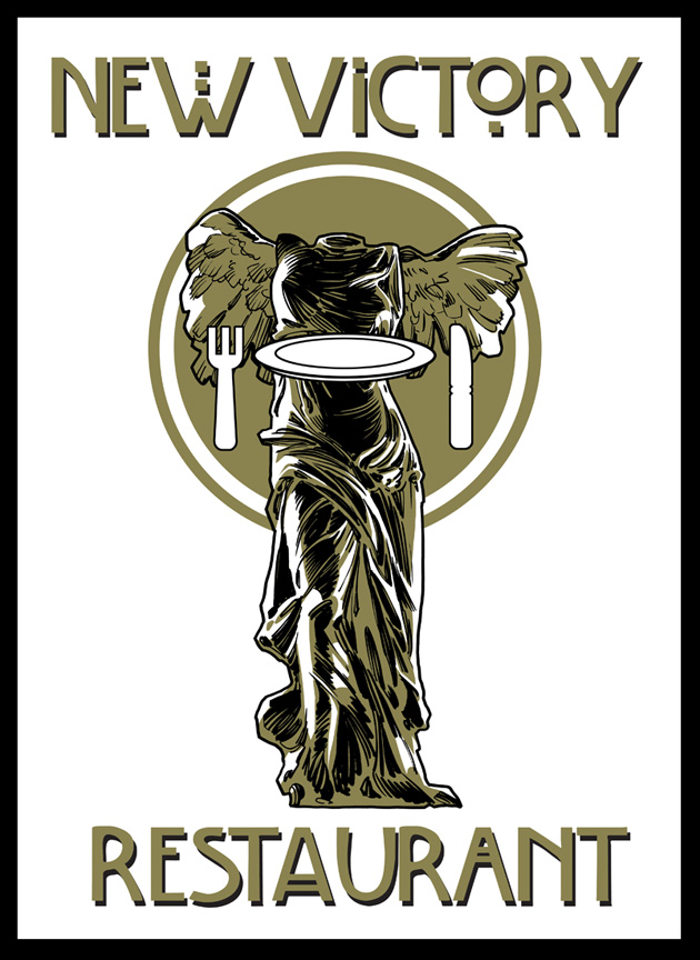
Did some art for a NYC Diner. Tried to mix the Moss [design, like the modernist store in NY ] flatware with the old look of the Nike statue they requested. Marrying old with new... Sorta works... I liked the type also. I think it would work better if "restaurant" wasn't used and "diner" was. Makes more sense from an illustrative standpoint when you look at the fork/knife and plate.
Fun though!
3 comments:
Wow! Really nice work man. Great detail, color and I even like the typeface choice.
My only comment and this is being pretty anal, is I'd push the utensils more towards realistic porportions. Having them graphic and silhouette is cool just less chunky and more elegant to match the rest of the design. They seem a bit cartoony graphic where as the figurine and motif is rendered in a very realistic sense.
Other then that it is excellent!
Nice work! The light and shadow contrast reminds me of Berni Wrightson's work.
Thanks guys! I agree with you on the fork/knife/plate aspect. Good point!
Post a Comment